
Mohammad Jafari
Author
In this notebook, we talk about dimensionality reduction fundamentals and reduce MNIST using PCA, t-SNE, UMAP, and LDA to visualize how the methods behave.
When dealing with real problems and real data we often deal with high dimensional data that can go up to millions. In the Big Data era, data is not only becoming bigger and bigger; it is also becoming more and more complex. This translates into a spectacular increase of the dimensionality of the data.
While in its original high dimensional structure the data represents itself best sometimes we might need to reduce its dimensionality. The need to reduce dimensionality is often associated with visualizations (reducing to 2–3 dimensions so we can plot it) but that is not always the case.
Sometimes we might value performance over precision so we could reduce 1,000 dimensional data to 10 dimensions so we can manipulate it faster (eg. calculate distances).
The need to reduce dimensionality at times is real and has many applications.
Dimensionality reduction is transforming high dimension data space into a lower dimension data space still maintaining the essence of the data.
A higher dimension space creates a Curse of dimensionality, which challenges data analysis, visualization, and machine learning model training due to data sparsity and concentration.
When a dataset has 100s of input features, additional training samples are required to capture all possible combinations for the model to generalize better. However, it also leads to data sparsity, where many input features have zero value.
Data sparsity leads to high variance, and the model will be over-fitting.
The curse of dimensionality is also known as the Hughes phenomenon or peaking phenomenon.
Hughes phenomenon or peaking phenomenon states, “As the number of input features increases, the machine learning model’s performance increases until an optimal number of input features. Beyond the optimal number of features, adding more input features decreases a model’s performance instead of improving”.
A reduced number of features in the dataset that are most relevant to the problem space have several advantages.
Easier Visualization: Reducing data dimension to 2-D or 3-D helps visualize the data to observe and understand the data pattern.
Increases speed to train the model: A dataset with reduced dimensionality will train the model faster as it would need less computation.
Increases model interpretability: Dimensionality reduction preserves only the most relevant features in a dataset, making the model simpler and easier to interpret.
Improves model accuracy: Irrelevant features in a dataset introduce noise and reduce the model's accuracy, whereas dimensionality reduction removes multi-colinear features to increase the model's accuracy.
Reduces Over-fitting: When a predictive model is trained on a noisy dataset, the model learns the noise and will not generalize well, leading to overfitting. Dimensionality reduction removes the noise in the dataset by including the features most influencing the prediction, thus reducing overfitting.
Avoids Curse of Dimensionality
Reduce storage space: Dimensionality reduction reduces the number of input features, reducing the disk space required for storage.
Most Dimensionality Reduction applications are used for:
One of the most critical aspects of Dimensionality reduction is Data Visualization. Having to drop the dimensionality down to two or three makes it possible to visualize the data on a 2d or 3d plot, meaning essential insights can be gained by analyzing these patterns in clusters and much more.
The two main approaches to reducing dimensionality: Projection and Manifold Learning.
Projection: This technique deals with projecting every data point in high dimension onto a subspace suitable lower-dimensional space in a way that approximately preserves the distances between the points.
Manifold Learning: Many dimensionality reductions algorithm work by modeling the manifold on which the training instance lie; this is called Manifold learning. It relies on the manifold hypothesis or assumption, which holds that most real-world high-dimensional datasets lie close to a much lower-dimensional manifold. This assumption, in most cases, is based on observation or experience rather than theory or pure logic.
Now let's briefly explain the four techniques before jumping into solving the use case.
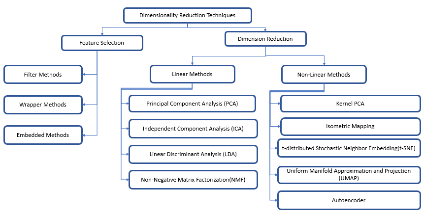
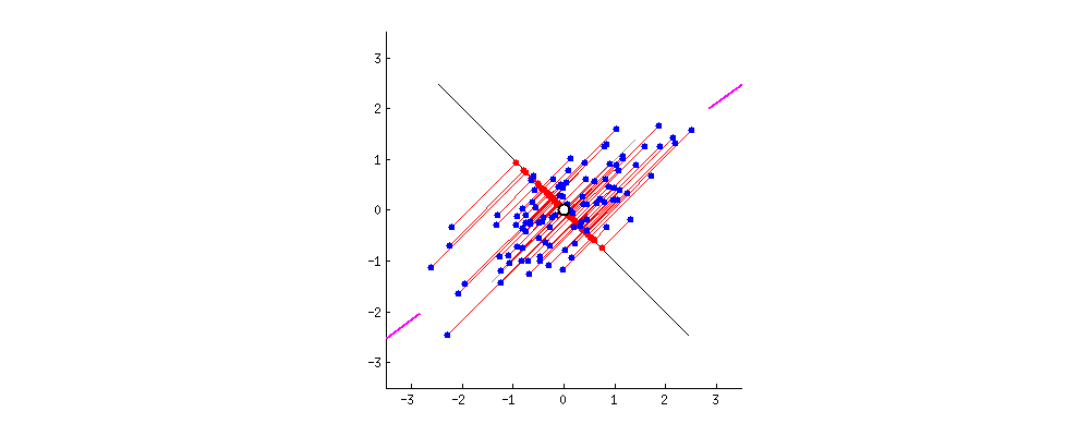
One of the most known dimensionality reduction “unsupervised” algorithms is PCA(Principal Component Analysis).
This works by identifying the hyperplane which lies closest to the data and then projects the data on that hyperplane while retaining most of the variation in the data set.
Principal Components: The axis that explains the maximum variance in the training set is called the Principal Components.
The axis orthogonal to this axis is called the second principal component. As we go for higher dimensions, PCA would find a third component orthogonal to the other two components. We always stick to 2 or a maximum of 3 principal components for visualization purposes.
The PCs can be determined via eigen decomposition of the covariance matrix C. After all, the geometrical meaning of eigen decomposition is to find a new coordinate system of the eigenvectors for C through rotations.
$$C = W\Lambda W^{-1}$$
In the equation above, the covariance matrix $C_(m×m)$ is decomposed to a matrix of eigenvectors $W_(m×m)$ and a diagonal matrix of $m$ eigenvalues $\Lambda$. The eigenvectors, which are the column vectors in W, are, in fact, the PCs we are seeking. We can then use matrix multiplication to project the data onto the PC space. For dimensionality reduction, we can project the data points onto the first k PCs as the representation of the data:
$$ X_k = XW_k $$
Though PCA is great, it does have some drawbacks. One of the major drawbacks of PCA is that it does not retain non-linear variance. This means PCA will not be able to get results for figures like this.
In simple terms, PCA works on retaining only global variance, and thus retaining local variance was the motivation behind t-SNE.
t-SNE is a nonlinear dimensionality reduction technique that is well suited for embedding high dimension data into lower dimensional data (2D or 3D) for data visualization.
t-SNE stands for t-distributed Stochastic Neighbor Embedding, which tells the following :
t-Distributed → probability distribution used by the algorithm to calculate similarity scores in the lower-dimensional embedding.
Stochastic → not definite but random probability
Neighbor → concerned only about retaining the variance of neighbor points
Embedding → plotting data into lower dimensions
In short, t-SNE is a machine learning algorithm that generates slightly different results each time on the same data set, focusing on retaining the structure of neighbor points.
Two parameters that can highly influence the results are
t-SNE constructs a probability distribution on pairs in higher dimensions such that similar objects are assigned a higher probability and dissimilar objects are assigned lower probability.
Then, t-SNE replicates the same probability distribution on lower dimensions iteratively till the Kullback-Leibler divergence is minimized.
Kullback-Leibler divergence is a measure of the difference between the probability distributions from Step 1 and Step 2. KL divergence is mathematically given as the expected value of the logarithm of the difference of these probability distributions.
You can play with different parameters and distributions here.
Uniform Manifold Approximation and Projection, created in 2018 by (Leland McInnes, John Healy, James Melville) is a general-purpose manifold learning and dimension reduction algorithm.
UMAP is a non-linear dimensionality reduction method. It effectively visualizes clusters or groups of data points and their relative proximities.
The significant difference with TSNE is scalability. It can be applied directly to sparse matrices, thereby eliminating the need to use any Dimensionality reduction such as PCA or Truncated SVD(Singular Value Decomposition) as a prior pre-processing step.
Put simply; it is similar to t-SNE but with probably higher processing speed; therefore, faster and probably better visualization.
UMAP approximates a manifold on which the data is assumed to lie and then constructs a fuzzy simplicial set representation of the approximated manifold.
UMAP is based on the following assumptions
UMAP can be described in two phases.
Here is a good article for understanding how UMAP works.
Linear Discriminant Analysis (LDA) is a commonly used dimensionality reduction technique. However, despite the similarities to Principal Component Analysis (PCA), it differs in one crucial aspect.
Instead of finding new axes (dimensions) that maximize the variation in the data, it focuses on maximizing the separability among the known categories (classes) in the target variable.t the axes that maximize the separation between multiple classes.
Unlike Principal Component Analysis (PCA), LDA requires you to provide features and class labels for your target. Hence, despite being a dimensionality reduction technique similar to PCA, it sits within the supervised branch of Machine Learning.
2 categories — when you have two classes in your target variable, the distance refers to the difference between the mean (μ) of class 1 and the mean of class 2.
More than two categories — when you have three or more classes in your target variable, the algorithm first finds a central point to all of the data and then measures the distance from each category mean (μ) to that central point.
Let’s illustrate the two criteria on a graph:
! pip install plotly
! pip install umap-learn
! pip install umap-learn[plot]
! pip install holoviews
! pip install -U ipykernel
import pandas as pd
import numpy as np
import plotly
import plotly.express as px
import matplotlib.pyplot as plt
from sklearn.datasets import load_digits # for MNIST data
from sklearn.model_selection import train_test_split
digits = load_digits()

# Load arrays containing digit data (64 pixels per image) and their true labels
X, y = load_digits(return_X_y=True)

# Some stats
print('Shape of digit images: ', digits.images.shape)
print('Shape of X (main data): ', X.shape)
print('Shape of y (true labels): ', y.shape)

# Display images of the first 10 digits
fig, axs = plt.subplots(2, 5, sharey=False, tight_layout=True, figsize=(12,6), facecolor='white')
n=0
plt.gray()
for i in range(0,2):
    for j in range(0,5):
        axs[i,j].matshow(digits.images[n])
        axs[i,j].set_xticks([]);
        axs[i,j].set_yticks([]);
        axs[i,j].set(title=y[n])
        n=n+1
plt.show()
Shape of digit images:  (1797, 8, 8)
Shape of X (main data):  (1797, 64)
Shape of y (true labels):  (1797,)

import plotly.graph_objects as go
import skimage.io as sio
import cv2
import numpy as np
import pandas as pd
import time

# For plotting
import plotly.io as plt_io
import plotly.graph_objects as go
%matplotlib inline
def plot_2d(component1, component2, labels, size=15):
    fig = go.Figure(data=go.Scatter(
        x = component1,
        y = component2,
        mode='markers',
        marker=dict(
            size=size,
            color=labels, #set color equal to a variable
            colorscale='Rainbow', # one of plotly colorscales
            showscale=True,
            line_width=1,
        ),
        hovertext = [str(label) for label in labels]
    ))

    fig.update_layout(margin=dict( l=100,r=100,b=100,t=100),width=1500,height=1200)

    return fig
def plot_3d(component1,component2,component3, labels, size=10):
    fig = go.Figure(data=[go.Scatter3d(
        x=component1,
        y=component2,
        z=component3,
        mode='markers',
        marker=dict(
            size=size,
            color=labels,                # set color to an array/list of desired values
            colorscale='Rainbow',   # choose a colorscale
            opacity=1,
            line_width=1
        ),
        hovertext=[str(label) for label in labels]
    )])

    fig.update_layout(margin=dict(l=50,r=50,b=50,t=50),width=1500,height=1000)

    return fig
durations = {}
from sklearn.preprocessing import StandardScaler
## Normalize the data
x_standard = StandardScaler().fit_transform(X)
from sklearn.decomposition import PCA
start = time.time()
pca = PCA(n_components=3)
PCA_components = pca.fit_transform(x_standard)
duration = time.time() - start
durations['PCA'] = duration
print('Duration: {} seconds'.format(duration))
Duration: 0.02001357078552246 seconds
plot_2d(PCA_components[:, 0],PCA_components[:, 1], y)
plot_3d(PCA_components[:, 0], PCA_components[:, 1], PCA_components[:, 2], y, size=10)
from sklearn.manifold import TSNE
start = time.time()
tsne = TSNE(
    n_components=3, # default=2, Dimension of the embedded space.
    perplexity=10, # default=30.0, The perplexity is related to the number of nearest neighbors that is used in other manifold learning algorithms.
    early_exaggeration=12, # default=12.0, Controls how tight natural clusters in the original space are in the embedded space and how much space will be between them.
    learning_rate=200, # default=200.0, The learning rate for t-SNE is usually in the range [10.0, 1000.0]. If the learning rate is too high, the data may look like a ‘ball’ with any point approximately equidistant from its nearest neighbours. If the learning rate is too low, most points may look compressed in a dense cloud with few outliers.
    n_iter=5000, # default=1000, Maximum number of iterations for the optimization. Should be at least 250.
    n_iter_without_progress=300, # default=300, Maximum number of iterations without progress before we abort the optimization, used after 250 initial iterations with early exaggeration.
    min_grad_norm=0.0000001, # default=1e-7, If the gradient norm is below this threshold, the optimization will be stopped.
    metric='euclidean', # default=’euclidean’, The metric to use when calculating distance between instances in a feature array.
    init='random', # {‘random’, ‘pca’} or ndarray of shape (n_samples, n_components), default=’random’. Initialization of embedding
    verbose=0, # default=0, Verbosity level.
    random_state=42, # RandomState instance or None, default=None. Determines the random number generator. Pass an int for reproducible results across multiple function calls.
    method='barnes_hut', # default=’barnes_hut’. By default the gradient calculation algorithm uses Barnes-Hut approximation running in O(NlogN) time. method=’exact’ will run on the slower, but exact, algorithm in O(N^2) time. The exact algorithm should be used when nearest-neighbor errors need to be better than 3%.
    angle=0.5, # default=0.5, Only used if method=’barnes_hut’ This is the trade-off between speed and accuracy for Barnes-Hut T-SNE.
    n_jobs=-1, # default=None, The number of parallel jobs to run for neighbors search. -1 means using all processors.
)
tSNE_components = tsne.fit_transform(x_standard)
duration = time.time() - start
durations['t-SNE'] = duration
print('Duration: {} seconds'.format(duration))
Duration: 85.79078960418701 seconds
plot_2d(tSNE_components[:, 0], tSNE_components[:, 1], y)
plot_3d(tSNE_components[:, 0],tSNE_components[:, 1], tSNE_components[:, 2], y, size=10)
from umap.umap_ import UMAP
start = time.time()
reducer = UMAP(n_neighbors=100, # default 15, The size of local neighborhood (in terms of number of neighboring sample points) used for manifold approximation.
               n_components=3, # default 2, The dimension of the space to embed into.
               metric='euclidean', # default 'euclidean', The metric to use to compute distances in high dimensional space.
               n_epochs=1000, # default None, The number of training epochs to be used in optimizing the low dimensional embedding. Larger values result in more accurate embeddings.
               learning_rate=1.0, # default 1.0, The initial learning rate for the embedding optimization.
               init='spectral', # default 'spectral', How to initialize the low dimensional embedding. Options are: {'spectral', 'random', A numpy array of initial embedding positions}.
               min_dist=0.1, # default 0.1, The effective minimum distance between embedded points.
               spread=1.0, # default 1.0, The effective scale of embedded points. In combination with ``min_dist`` this determines how clustered/clumped the embedded points are.
               low_memory=False, # default False, For some datasets the nearest neighbor computation can consume a lot of memory. If you find that UMAP is failing due to memory constraints consider setting this option to True.
               set_op_mix_ratio=1.0, # default 1.0, The value of this parameter should be between 0.0 and 1.0; a value of 1.0 will use a pure fuzzy union, while 0.0 will use a pure fuzzy intersection.
               local_connectivity=1, # default 1, The local connectivity required -- i.e. the number of nearest neighbors that should be assumed to be connected at a local level.
               repulsion_strength=1.0, # default 1.0, Weighting applied to negative samples in low dimensional embedding optimization.
               negative_sample_rate=5, # default 5, Increasing this value will result in greater repulsive force being applied, greater optimization cost, but slightly more accuracy.
               transform_queue_size=4.0, # default 4.0, Larger values will result in slower performance but more accurate nearest neighbor evaluation.
               a=None, # default None, More specific parameters controlling the embedding. If None these values are set automatically as determined by ``min_dist`` and ``spread``.
               b=None, # default None, More specific parameters controlling the embedding. If None these values are set automatically as determined by ``min_dist`` and ``spread``.
               random_state=42, # default: None, If int, random_state is the seed used by the random number generator;
               metric_kwds=None, # default None) Arguments to pass on to the metric, such as the ``p`` value for Minkowski distance.
               angular_rp_forest=False, # default False, Whether to use an angular random projection forest to initialise the approximate nearest neighbor search.
               target_n_neighbors=-1, # default -1, The number of nearest neighbors to use to construct the target simplcial set. If set to -1 use the ``n_neighbors`` value.
               #target_metric='categorical', # default 'categorical', The metric used to measure distance for a target array is using supervised dimension reduction. By default this is 'categorical' which will measure distance in terms of whether categories match or are different.
               #target_metric_kwds=None, # dict, default None, Keyword argument to pass to the target metric when performing supervised dimension reduction. If None then no arguments are passed on.
               #target_weight=0.5, # default 0.5, weighting factor between data topology and target topology.
               transform_seed=42, # default 42, Random seed used for the stochastic aspects of the transform operation.
               verbose=False, # default False, Controls verbosity of logging.
               unique=False, # default False, Controls if the rows of your data should be uniqued before being embedded.
              )
embedding = reducer.fit_transform(x_standard)
UMAP_components = reducer.embedding_
duration = time.time() - start
durations['UMAP'] = duration
print('Duration: {} seconds'.format(duration))
Duration: 24.376087188720703 seconds
plot_2d(UMAP_components[:, 0], UMAP_components[:, 1], y)
plot_3d(UMAP_components[:, 0], UMAP_components[:, 1], UMAP_components[:, 2], y, size=10)
from sklearn.discriminant_analysis import LinearDiscriminantAnalysis as LDA
start = time.time()
LDA_components = LDA(n_components=3).fit_transform(x_standard, y)
duration = time.time() - start
durations['LDA'] = duration
print('Duration: {} seconds'.format(duration))
Duration: 0.05424618721008301 seconds
plot_2d(LDA_components[:, 0], LDA_components[:, 1], y)
plot_3d(LDA_components[:, 0], LDA_components[:, 1], LDA_components[:, 2], y, size=10)
df = pd.DataFrame(data=durations, index=['time'])
df
| PCA | t-SNE | UMAP | LDA | |
|---|---|---|---|---|
| time | 0.020014 | 85.79079 | 24.376087 | 0.054246 |
from plotly.subplots import make_subplots

def plot_2by2_grids(plots, type, titles):
  # Initialize figure with 4 subplots
    fig = make_subplots(
        rows=2, cols=2,
        specs=[[{'type': type}, {'type': type}],
              [{'type': type}, {'type': type}]],
        subplot_titles=titles)

    # adding surfaces to subplots.
    for data in plots[0]:
      fig.add_trace(
          data,
          row=1, col=1)

    for data in plots[1]:
      fig.add_trace(
          data,
          row=1, col=2)

    for data in plots[2]:
      fig.add_trace(
          data,
          row=2, col=1)

    for data in plots[3]:
      fig.add_trace(
          data,
          row=2, col=2)

    fig.update_layout(
        margin=dict(l=50,r=50,b=50,t=50),
        height=1000,
        width=1500
    )

    return fig
components = [PCA_components, tSNE_components, UMAP_components, LDA_components]
names = ['PCA', 't-SNE', 'UMAP', 'LDA']
plot_2by2_grids(
    plots = [plot_2d(component[:, 0], component[:, 1], y).data for component in components],
    type='scatter',
    titles = names
)
plot_2by2_grids(
    plots = [plot_3d(component[:, 0], component[:, 1],  component[:, 2], y, 5).data for component in components],
    type='scatter3d',
    titles = names
)
def plot_digits_3d(component1, component2, component3, labels, images):
    data = []
    size = 0.8
    for x_src, y_src, z_src, label, img in zip(component1, component2, component3, labels, images):
      img /= 16
      sh_0, sh_1 = 40, 40
      x, y = np.linspace(-size, size, sh_0) + x_src, np.linspace(-size, size, sh_1) + y_src
      z = np.zeros((sh_0, sh_1)) + z_src
      img = cv2.resize(img,(sh_0, sh_1),fx=0, fy=0, interpolation = cv2.INTER_NEAREST)
      color =  (label / 10) * 360
      data.append(
          go.Surface(
          x=x, y=y, z=z,
          surfacecolor = 1 - np.fliplr(img).astype(np.float32),
          colorscale = [[0.0, f'hsv({color},0,10)'], [1.0, f'hsv({color},100,80)']],
          opacity = 0.95,
          hovertext=str(label),
          name = str(label)
          )
      )

    fig = go.Figure(data=data)
    # Update chart looks
    fig.update_traces(showscale=False)
    fig.update_layout(showlegend=True,
                      legend=dict(orientation="h", yanchor="top", y=0, xanchor="center", x=0.5),
                      scene_camera=dict(up=dict(x=0, y=0, z=1),
                                            center=dict(x=0, y=0, z=-0.1),
                                            eye=dict(x=1.5, y=-1.4, z=1.5)),
                                            margin=dict(l=0, r=0, b=0, t=0))


    return fig
sample_number = 100
indices = np.random.choice(len(digits.images), sample_number)

plot_2by2_grids(
    plots = [plot_digits_3d(component[:, 0][indices], component[:, 1][indices], component[:, 2][indices], y[indices], digits.images[indices]).data for component in components],
    type='surface',
    titles = names
)
PCA could not do such an excellent job in differentiating the signs. The main drawback of PCA is that it is highly influenced by outliers present in the data. PCA is a linear projection, which means it can’t capture non-linear dependencies; its goal is to find the directions (the so-called principal components) that maximize the variance in a dataset.
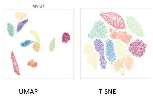
t-SNE does a better job(it tries to preserve topology neighborhood structure) than PCA when it comes to visualizing the different patterns of the clusters. Similar labels are clustered together, even though there are oversized agglomerates of data points on top of each other, which is certainly not good enough to expect a clustering algorithm to perform well.
UMAP outperformed t-SNE and PCA; if we look at the 2d and 3d plots, we can see mini-clusters that are being separated well. It effectively visualizes clusters or groups of data points and their relative proximities. However, for this use case indeed not good enough to expect a clustering algorithm to distinguish the patterns.UMAP is much faster than t-SNE; another problem faced by the latter is the need for another dimensionality reduction method; otherwise, it would take longer to compute.
Finally, LDA outperformed all the previous techniques in all aspects. Excellent computation time (second fastest) proves our expected well-separated clusters.
Note: it is not surprising that LDA performed better than the other techniques; that was what we were expecting. Unlike LDA, PCA, TSNE, and UMAP are performed without knowing the true class label.
We have explored four dimensionality reduction techniques for data visualization : (PCA, t-SNE, UMAP, and LDA) and tried to use them to visualize a high-dimensional dataset in 2d and 3d plots.
Note: It is not difficult to fall into the trap of considering one technique better than the other. At the end of the day, there is no way to map high-dimensional data into low dimensions and preserve the whole structure simultaneously; there is always a trade-off of qualities one technique will have compared to the other.